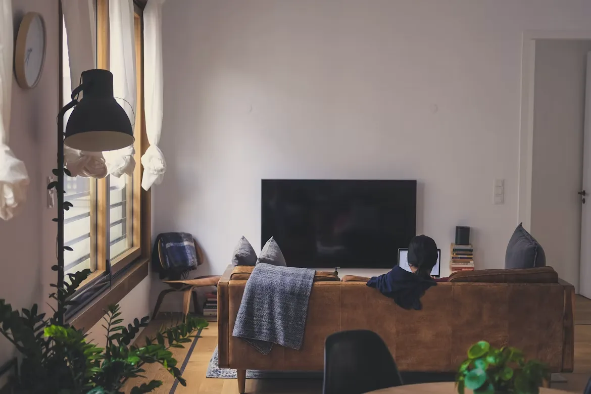
Blank walls can make a room feel cold, sterile, and completely unfinished. Transforming an empty vertical surface changes the entire mood of your home by creating an immediate visual anchor.
Plain brick or plaster quickly turns into a personal design statement that reflects your daily lifestyle. You can showcase favorite travel memories and unique art pieces with a carefully curated display.
The Balanced Linear Grid
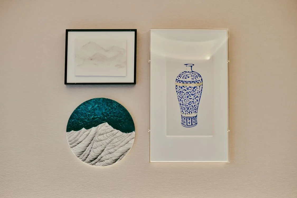
Symmetrical layouts provide a clean and orderly look for modern living rooms and home offices. This particular format uses precise math and uniform spacing to form a neat geometric shape on your wall.
A design report noted that these displays remain popular across the design spectrum, ranging from packed arrangements to thin, airy setups. This flexible nature lets you adjust the layout based on your individual room dimensions and furniture choices.
The grid format delivers the best results with high-contrast black and white photography or uniform architectural sketches. You achieve an orderly feeling that grounds the furniture sitting directly below the installation.
Mismatched Frames and Sizes
Selecting the right materials prevents future alignment issues and keeps your collection looking sharp. Ordering custom borders from EasyFrame UK or similar options helps achieve a polished appearance without standard size limitations. High-quality components protect your art from moisture and warping over the years.
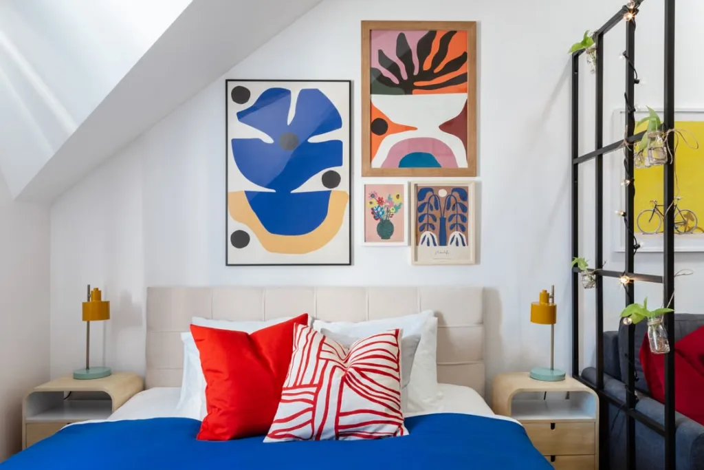
Mixing different colors, shapes, and frame textures creates a highly organic aesthetic in casual spaces. You can pair sleek modern metal with distressed rustic wood to add layered character to the room.
An interior update suggested that rigid spacing and identical structures can feel a bit dated now. Moving away from strict perfection gives your home a more relaxed and welcoming vibe.
The Single Midline Row
Hanging your artwork along a solitary horizontal axis creates an immediate focal point in narrow spaces. This clever method guides the human eye smoothly from one side of the room to the other.
Industry guidelines recommend a single straight line of 3 to 7 prints hung at the same midline. This neat approach works beautifully in long hallways, entryways, or positioned directly above low-profile sofas.
Measuring carefully from the exact center point of each frame maintains the necessary visual balance. This strict alignment looks highly deliberate and keeps the wall from feeling cluttered or chaotic.
Floor to Ceiling Eclecticism
Massive displays that span all the way from the baseboard to the ceiling molding make a dramatic statement. This bold style fits creative individuals who own substantial art collections and want to display them proudly.
You can freely combine classic oil paintings with modern concert posters, textiles, and personal sketches. The sheer volume of frames creates a striking visual destination that demands attention from anyone entering the room.
Leaving a consistent small gap between the random pieces maintains readability across the collection. The entire room gains a historic museum atmosphere that instantly sparks conversation with your guests.
The Ledges and Shelves Method
Installing slim picture ledges allows you to swap your artwork around without drilling new holes every time. This flexible option suits renters or people who change their interior decor style frequently throughout the year.
Layering different frames of varying heights on a single shelf creates a natural sense of physical depth. Here are 3 common items to include on a ledge display:
- Large statement prints to establish a strong background layer
- Small framed postcards or sketches tucked neatly in front
- Tiny ceramic objects or small potted plants to break up flat lines
Moving the pieces around takes only 2 minutes and requires zero tools or measurements. You can rotate seasonal prints easily or add holiday-themed decor items whenever you want a fresh look.
Monochromatic Color Schemes
Sticking to a single dominant color hue unifies completely disparate subjects and frame styles. A unified green or deep blue palette ties completely different images into one cohesive visual family. It prevents the display from overwhelming a smaller room.
The shared color palette lets you experiment safely with wildly different art movements and mediums. Abstract geometric shapes sit comfortably next to vintage botanical prints when they share the same ink tones. The final result feels highly curated and professional.
Matching your wall paint color directly to the frame mats pushes creative boundaries in a modern home. The artwork appears to emerge directly out of the architecture itself, creating a subtle shadowbox effect.
Corner Wrap Around Layouts
Utilizing the dead space where 2 walls meet softens sharp architectural angles and draws people in. This unexpected placement guides visitors deeper into the room by continuing the visual narrative around a bend.
The wrap-around layout extends the visual boundaries of a small home office or a cozy reading nook. It turns an overlooked architectural limitation into a stunning design asset that feels custom-built for the property.
Balancing the total visual weight on both sides of the corner prevents a lopsided look. The entire arrangement flows naturally from one flat surface to the next, tying the whole room together beautifully.
Arranging a beautiful personal gallery requires a bit of patience and some basic measurements. Taking your time during the planning phase prevents costly mistakes and unnecessary holes in your drywall.
Remember to step back frequently to review the overall spacing as you hang each piece. Your home will feel complete with a stunning display that perfectly matches your unique lifestyle.