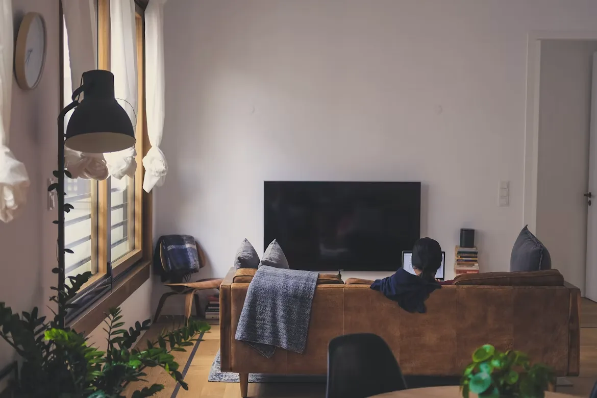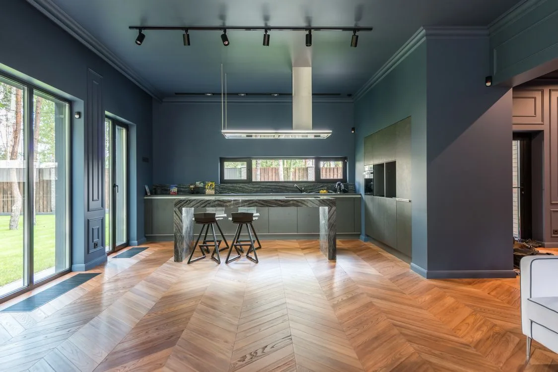
Color drenching is not as dramatic as it sounds. It simply means using one color across walls, trim, doors, built-ins, and sometimes the ceiling. Instead of stopping at one feature wall, the color takes over the whole room.
And that’s why it works.
A single accent wall can look nice, but it can also feel unfinished. Like the room almost had an idea, then backed out. Color drenching feels braver. More complete. It gives the room a clear point of view without needing oversized artwork, expensive furniture, or too many decorative pieces fighting for attention.
A soft clay bedroom. A deep green study. A warm beige hallway. Simple choices, but they can make a room feel far more intentional.
Why It Makes a Room Feel Planned
Rooms often feel messy because the eye has too many stopping points. White trim. Bright doors. A ceiling that cuts the wall in half visually. Different finishes everywhere. None of these are “wrong,” but together they can make a space feel busy.
Color drenching calms that down.
When one shade wraps around the room, edges soften. Corners feel less awkward. Low ceilings feel less choppy. Even a small room can feel cozy instead of cramped. That’s the sweet spot.
A powder room, for example, can go from plain to polished with one strong color across the walls and ceiling. No renovation needed. Just commitment and a decent paintbrush. Maybe a little patience too, because cutting around a door frame is nobody’s idea of a relaxing Saturday.
It Brings Out the Architecture
Here’s where color drenching surprises people. Painting trim, doors, shelves, and wall panels the same color doesn’t always hide them. It can make them look more sculptural.
The light still catches the edges. The shapes still show. They just stop competing with everything else.
This works especially well in homes with wall molding, arched openings, built-in shelving, or detailed doors. It also helps newer homes that feel a little too plain. Some modern rooms have great bones, but they can look bare once the furniture goes in. Color gives them mood.
For new builds in Queensland, working with custom home builders Brisbane can also help homeowners think about these choices earlier, especially in areas where bright light, open-plan layouts, and indoor-outdoor spaces affect how colors appear throughout the day.
Choose the Color Carefully
Not every shade should cover an entire room. That sounds harsh, but it’s true.
A color that looks beautiful on a small sample card can feel completely different once it’s on four walls, a door, trim, and a ceiling. Light changes everything. Morning light can make a color feel fresh. Afternoon sun can pull out yellow or red undertones. At night, under warm bulbs, the same shade might feel richer or heavier.
Testing matters.
Muted greens, dusty blues, soft mushroom tones, clay shades, warm creams, and gentle taupes are often easier to live with. Darker colors can work beautifully too, but they suit certain rooms better. A deep plum bedroom? Lovely. A dark navy kitchen with poor lighting? Maybe not.
When a room color feels “off,” it’s usually not because the color is ugly. It’s because the room, lighting, and finish don’t agree with it. Paint has a personality. Annoying, but true.
Furniture Looks More Intentional Against a Strong Background
Color drenching can make furniture feel more curated, even when the pieces are not perfectly matched.
A wood dining table looks richer against a saturated wall. A cream sofa feels softer in a warm, enveloping room. Art stands out without needing a loud frame. Curtains look more considered. Even basic shelving can feel built-in when it shares the wall color.
That’s one of the best things about this approach. It lets the room do more of the design work.
Not every home needs a full set of matching furniture. Actually, most homes are better without it. A few mixed pieces make a room feel lived in. Color drenching can pull those pieces together so the space feels layered rather than random.
Don’t Ignore the Ceiling
The ceiling is where people hesitate. Fair enough. Painting it the same color as the walls can feel like a big move.
But it can be the detail that makes the whole room work.
A white ceiling can sometimes look like an afterthought, especially in a small room with a rich wall color. It breaks the mood. It says, “We got nervous up here.” Painting the ceiling creates a cocoon effect. Bedrooms feel calmer. Dining rooms feel more intimate. Powder rooms feel more dramatic.
Will it make the ceiling feel lower? Sometimes. But that’s not always bad. A lower, softer feeling can make a room feel snug and finished. The trick is knowing where that mood belongs.
Living room with low natural light? Think carefully. Small reading nook? Go for it.
It Can Shape First Impressions
A well-designed room makes people pause. Not because it’s loud, but because it feels resolved.
Color drenching can help create that reaction. It makes a room photograph better, feel more memorable, and appear more carefully finished. This can matter when a home is being styled, renovated, or prepared for sale.
Of course, paint alone doesn’t determine value. Residential property valuations consider a wider set of factors, including location, land size, building condition, layout, improvements, and comparable sales. Still, a home that feels thoughtfully presented can make a stronger first impression during inspections, photography, and buyer walk-throughs.
Design can’t do everything. But it can definitely help a home feel cared for.
Where Color Drenching Works Best
Some rooms are made for this look.
Powder rooms are an easy win because they’re small and separate. A bold color feels exciting there, not overwhelming. Bedrooms are another strong choice, especially with restful shades like olive, blue-gray, terracotta, or warm beige.
Hallways deserve more attention too. They often get treated like leftover space, which is a shame. A drenched hallway can feel elegant and atmospheric, especially with good lighting and simple artwork.
Studies, libraries, and media rooms also suit deeper color. These spaces already invite focus and comfort, so a darker shade can feel natural.
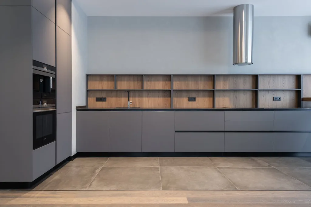
Kitchens need more caution. There are cabinets, countertops, appliances, tiles, and hardware all competing for attention. A fully drenched kitchen can work, but it needs discipline. A dining nook or pantry might be the safer place to start.
Designed, Not Just Decorated
Color drenching works because it changes how a room is read. The walls stop acting like a blank background and start becoming part of the design.
That’s the difference.
A decorated room can still feel like furniture placed inside a box. A designed room feels connected from wall to ceiling, from trim to sofa, from lighting to mood. Color drenching helps create that connection.
It doesn’t need to be extreme. It doesn’t need to be dark. It just needs to be deliberate.
One color. Used properly. Enough confidence to carry it through.
That can be all it takes to make a room feel like it finally knows what it’s doing.